Allrighty, then. My “new” primary desktop build is almost completely done. I still have some software to install, and some file transfers from old to new to complete. But the hardware configuration is finished. As this NZXT H6 Flow build comes together, I’ve overcome some interesting hurdles and learned something I probably should have already known. Let me fill you in…
Deets: NZXT H6 Flow Build Comes Together
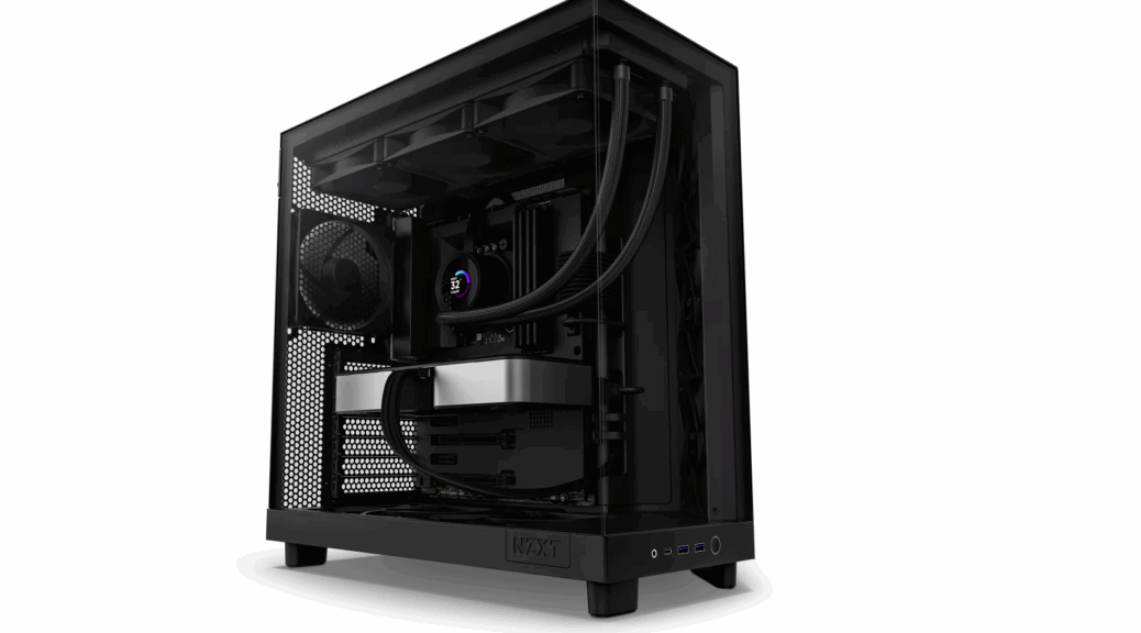
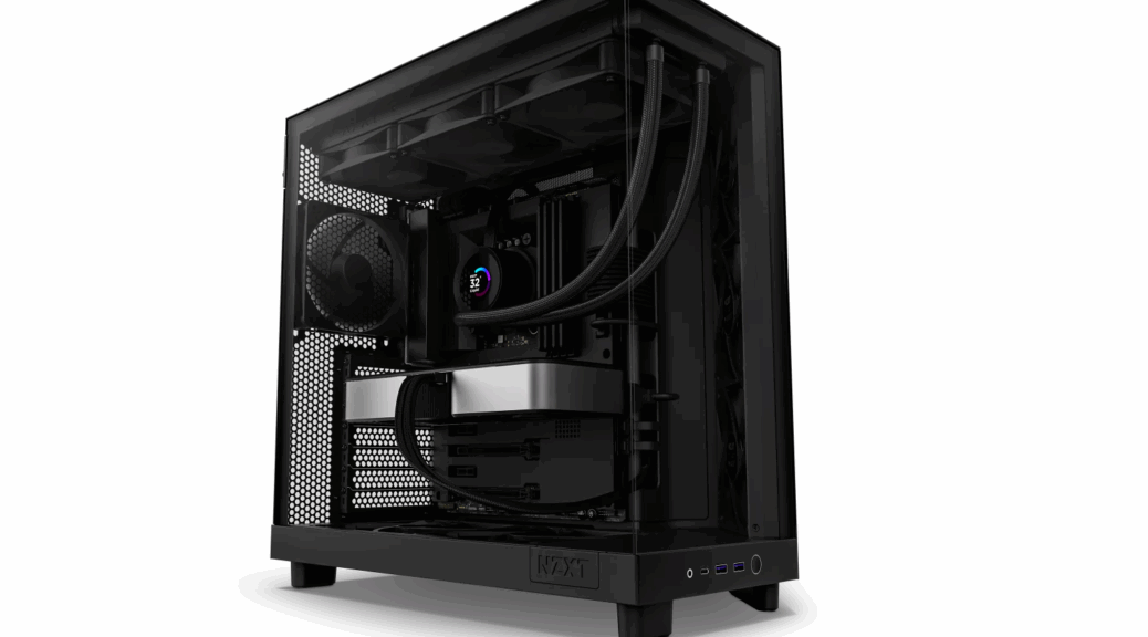
The case itself is perhaps the roomiest I’ve ever worked with. The split-level design features the motherboard and plug-in elements above, with PSU, drive cage and cabling below. Very easy to work on, and far fewer cable routing shenanigans than I’ve ever run into before. Over the years — including a lengthy stint of motherboard, RAM and storage reviews for Tom’s Hardware in the early 2000s — I’ve probably built 100+ desktop and SFF PCs. From the perspective of ease and comfort, this one rules. First ever build, in fact, without cutting my fingers on the air cooler’s fins. Good-oh.
Here’s a BOM for the build, excluding the already-mentioned case [for which I paid US$110; other current prices in square brackets]:
- Motherboard: Asrock B550 Extreme 4 (AM4) [US$185]
- CPU: AMD Ryzen 7 5800X (8 cores/16 threads, 3.8 to 4.7 GHz, AM4, TDP 105W) [US$170]
- GPU: NVIDIA 3070 Ti [US$600]
- RAM: 128GB (4×32) DDR4-2666 [US$146]
- NVMe: Sabrent Rocket Q 2TB[US$80], Samsung 990 EVO 4TB (2ndary)[US$200]
- Hard disk: Toshiba DT01AC300 3GiB (2.72 TB in Explorer)[US$77]
- Total system cost, not including monitors: US$1,568
My ASUS Thunderbolt5 EX didn’t make the cut, because the B550 lacks a USB4/5 header for the device to plug into. Alas it won’t work without motherboard support. Sigh. I should have known, but there it is.
Issues Encountered and Overcome
The only build issues I ran into were:
- Remembering how to re-insert the below-deck HDD cage. (A quick trip to YouTube took care of that in a hurry. Turns out to be a drop in, then slide up to lock into position kind of maneuver. Dead easy, once you see somebody else do it. Go YouTube!)
- Getting the hard disk recognized in Device Manager. (None of my SATA devices showed up in Windows Device Manager or Disk Management. I used a temporary SSD-to-SATA device to ensure it was getting power (it got warm). So I knew it was a software issue. Thus, I was inspired to reload the “Standard SATA AHCI Controller:” right-click the entry, Update driver, Browse my computer for drivers, Let me pick from a list…, reload the only entry showing. The plugged in SATA drive appeared immediately thereafter. Yay!
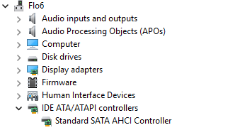
No drives appeared until I reloaded the standard SATA AHCI controller driver. Then, they popped right up.
Otherwise, this was a terrific, if time-consuming, experience. Because I must wear reading glasses now for close-in work (cataract surgery last fall), I had to give myself extra light and room for the build. I ended up taking over the island in our kitchen (covered with old towels) for the initial assembly, and then for final cable arrangement and clean-up. Except for the SATA HDD and the lack of USB4 support that knocked out the Thunderbolt5 EX, everything worked on the first try. Amazing!
IMO, things turned out extremely well. I’ll be switching over to this build sometime this week. Stay tuned: I’ll tell you more soon.