In reading over yesterday’s news, I found Paul Thurrott’s story on GA for the Amazon Appstore on Windows 11. Being both curious and adventurous, I went ahead and installed same on one of my Lenovo test PCs (a beast: the P16 Gen1 Workstation with i9-12950HX, 128 GB RAM, 1.5 TB NVMe SSDs). There’s a little more going on behind the scenes than meets the eye, but things are arranged now so that for Windows 11 Android Subsystem gets easy-peasey. Let me explain…
What Android Subsystem Gets Easy-Peasey Means
Amazon has built its Amazon Appstore as a Windows Store download. If you grab and install it, and the Windows Subsystem for Android is absent on the target PC, the installer first makes sure this underlying environment is up and running. Then it installs itself. The whole process took about 3 minutes on the admittedly over-powered P16 Workstation. But it required no extra effort on my part to get the Amazon Appstore installed and running.
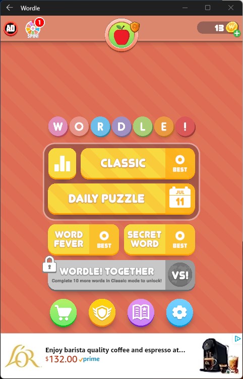
Just for grins, I downloaded and installed Wordle from the Appstore to make sure things were working. It’s been a while since I ran the Android version. I’d forgotten how obnoxious and ad-laden the free version of that app really is. Suffice it to say: NOW I remember!
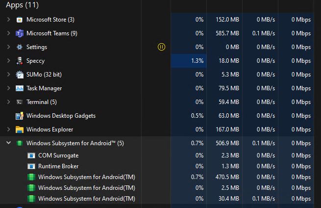
Android apps run in their own self-contained windows on the desktop, inside the WSA (Windows Subsytems for Android) container process as shown in Task Manager at top.
Overall, Amazon has done an excellent job of making the install-to-download-to-desktop process simple, fast and easy. Feel free to give it a try on Windows 11. As far as I can tell it runs on all current versions, production and Insider Preview releases alike. Good stuff!