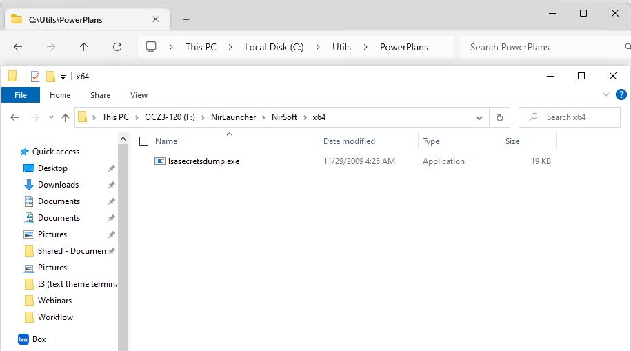
In working with the new-look File Explorer in the Beta Channel Insider Preview, I’ve come to a conclusion. It stands as the title for this blog post — namely, this: the new Explorer Address Bar is too spread out. IMO, anyway. Take a look at the lead-in graphic to see what I mean (new address bar top, old address bar bottom).
Why Say: New Explorer Address Bar Is Too Spread Out
The top of the image shows the address bar consuming about 3.8″ of the total 8.5″ display on-screen. By contrast, the bottom shows it consuming 3.125″. That’s a 21.6% bump in on screen size, most of which comes from wider spacing between path elements (and the > symbol that replaces the \ in a fully-formed directory path). Here are the paths for the two contrasting folders themselves:
new-style: C:\Utils\PowerPlans

old-style: F:\Nirlauncher\NirSoft\x64
This observed, the text displayed inside the address bar for File Explorer for each version is a little different, as you can confirm by inspection:
new-style: This PC > Local Disk (C:) > Utils > PowerPlans

old-style: This PC > OCZ3-120 (F:) > Nirlauncher > Nirsoft > x64
The upper display consumes more screen space than the lower even though it’s shorter (46 characters in the upper line; 53 on the lower, counting each space as a single character). Thus, it’s even more spread out than the visuals show by direct comparison. Because the upper string is 15% shorter, the expansion comes to roughly 40% (multiply 1.15 by 1.216).
Is Brevity the Soul of Wit?
Methinks that a more compact address bar makes it easier — and faster — to consume its contents. I’d urge MS to offer a compact version of the address bar as a tweak in future releases. If they don’t, somebody will probably do so in an add-on tool (e.g. WinAero Tweaker). I guess we’ll have to wait and see what happens, perhaps in the upcoming 23H2 version of Windows 11. To that end, I hope somebody at MS is listening…
Note Added August 3
One person who read this post suggested that this spacing is designed to make touch access to the address bar easier. I buy the notion that added spacing makes touch more effective. But I still think MS should add a “compact address bar” option to its File Explorer controls so that those not using touch can elect a more condensed presentation if they want it. ‘Nuff said…
Totally agree here. The new sizing is far too large.
It’s been observed this makes it much more touch friendly. I guess that’s right, but I still want MS to provide a switch between “compact” and “expanded” spacing. Thanks for commenting. =Ed+
I totally agree! It has already been a source of error for me many times!
Thanks for sharing. Nice to know it’s not “just me.” =e=